Guindo Design
Strategic Digital Product Design
pisos.com
Real estate portal redesign
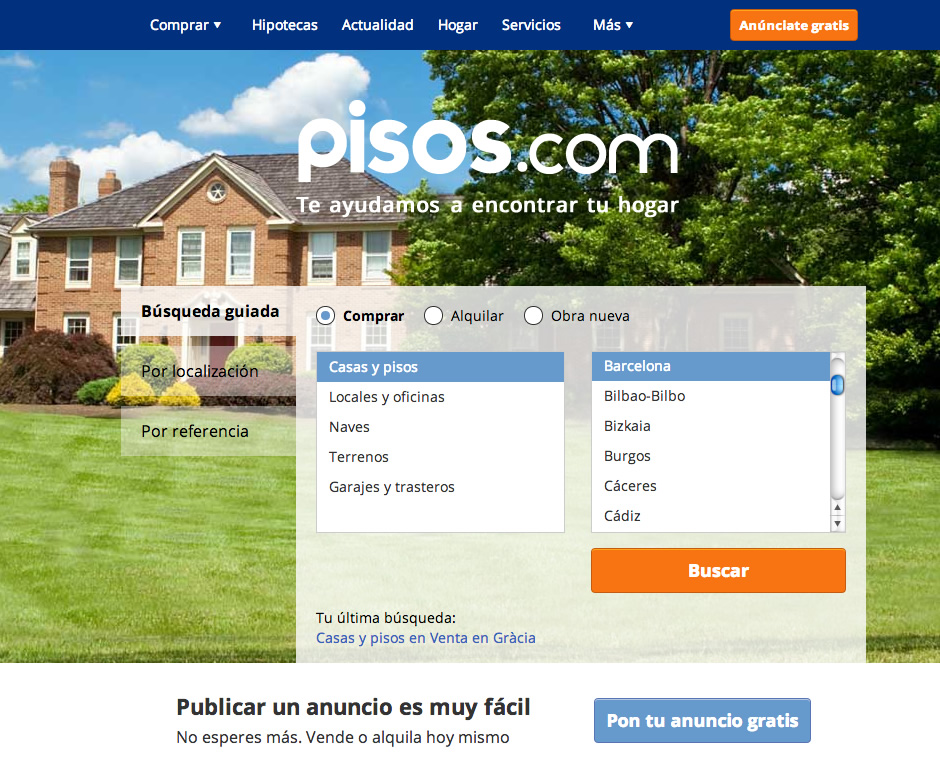
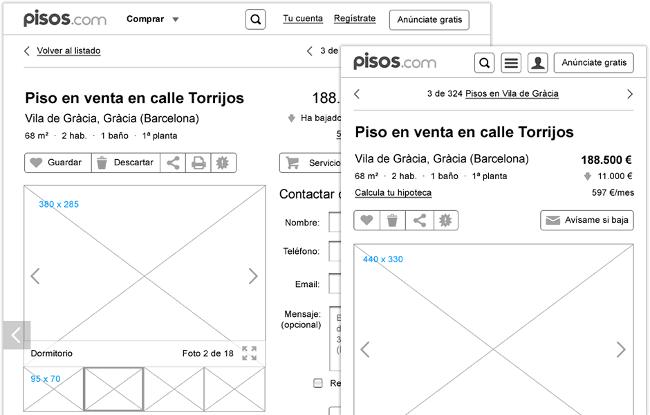
Collaboration with pisos.com product team, where we participated from the definition of the initial prototypes to the visual design final proposals.

A design with a responsive approach, optimized for desktop and tablets, where we took into account the balance between the user experience and the business requirements goals.

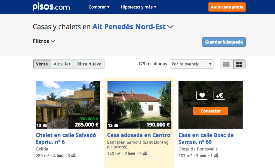
The new design inherits many of the improvements made by pisos.com in the last 5 years, putting the user on the product focus and prioritizing its browsing experience, facilitating searches on any device and encouraging exploration.
The information is now more clearly visible through a better organization of the content. Listings gain prominence through the new presentation of the pictures and the existence of relevant and qualitative data about the area. The interface has been simplified by improving the readability and the use of a flexible grid, that ensures consistency in all sections, as well as the introduction of larger images on all pages with a immersive visualization on the detail pages.

Since the new design was launched progressively, it has been improved significantly the conversion rates and incidents were reduced. The feedback from regular users was also very positive.
In short, this new structure and layout, allows managers to perform experiments and product improvements to further optimize the portal.