Guindo Design
Strategic Digital Product Design
AXA Assistance
eCommerce platform definition
In early October 2014, we initiated a collaboration with AXA Assistance Digital Services team, in order to help them to define their new eCommerce platform for all kind of insurances.
The new platform was aimed to be:
- User centered, identifying their needs, concerns and expectations, when hiring a insurance.
- Multidevice design
- Customizable for each one of the branches and business units.
- Sales oriented: add-ons, up-sell and cross-sell
As a first foundation, we opted for the Travel Insurances eComerce, as it was going to be the first business unit where the new framework would be implemented.
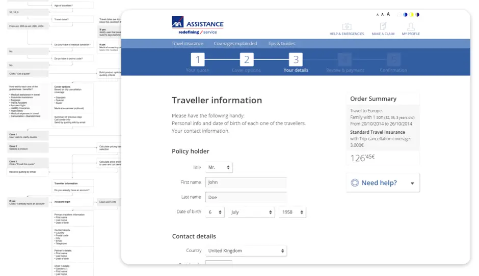
In order to better understand the whole process of hiring a travel insurance, we built a User Journey mapping and identifying scenarios, friction points between across the actors (customers, website, platform and Call Center), feature gaps, unresolved doubts and requirements. This document, once discussed and iterated by business and technology managers, served both to define and review the functional prototype, as well to narrow the technological implementation phases.

After performing a benchmark, identifying industry best practices and interaction patterns of related services, we built a responsive prototype addressing the simulation of hiring an insurance, as it was a very sensitive flow with a significant dropout rate.
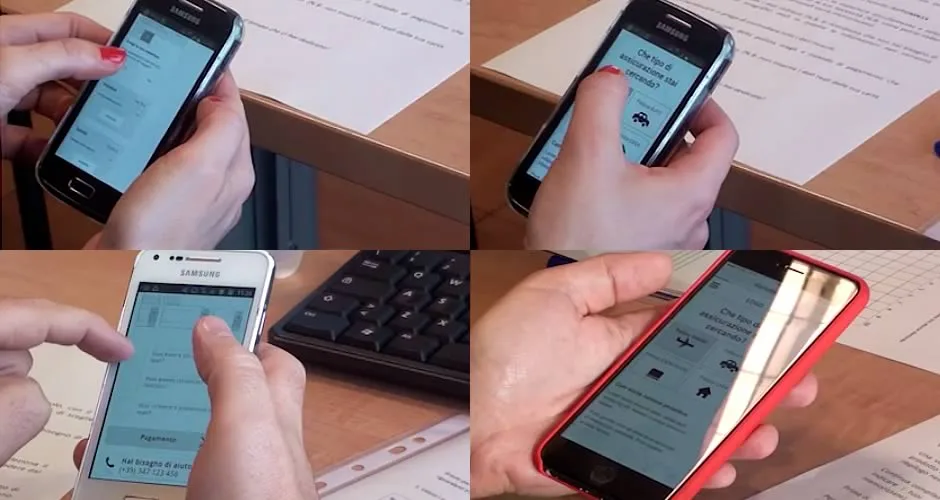
Both the mobile and desktop version of these prototypes were tested with remote users from UK, with a success rate over 90%. This usability tests were also very helpful in order to polish small interactions and refining the instructions.
After polishing the hiring process, we continued defining the remaining sections of the eCommerce. With the complete prototype built, we held another round of test, this time with users from Italy, as it would be the first delegation in which the new platform would be implemented. We focus especially on the mobile version of the prototype, because of the obvious posed limitations.

Given the type of products offered, one of the biggest challenges was the translation of business requirements into a nearby users language, since the tone of the most existing documentation was too technical. Besides, insurance products respond to complex price matrices, with many variables, constraints and multipliers. In fact the greatest difficulties on most of the users interviewed, came from the understanding of the contracted products and price tables.
Once collected the feedback from both users and product managers, all relevant changes in the prototype were performed, which served as a functional document for both the front-end and systems teams.
In addition to the good results, the project served as a spearhead to increase the visibility of the UX team of AXA Assistance throughout the organization, and introduce the User Centered Design methodology on other projects and initiatives.