Guindo Design
Strategic Digital Product Design
Autocasión
Information architecture and portal redesign
Autocasión is a portal focused on content and transactional services for the purchase of vehicles, as well as current information about the world of motor.
As a result of our good experience with pisos.com project, Vocento group returned to trust us during 2015 to restructure and redesign one of its flagship portals. The portal needed a redefinition of the information architecture and a new design that meet the following requirements:
- Improve the conversion rate and recurrence.
- Facilitate access to more user profiles.
- Improve the integration of advertising formats, in order to provide more value and not hamper the work of users.
- Integrate coherently both current and new functionalities, taking into account the modularity and scalability of the platform.
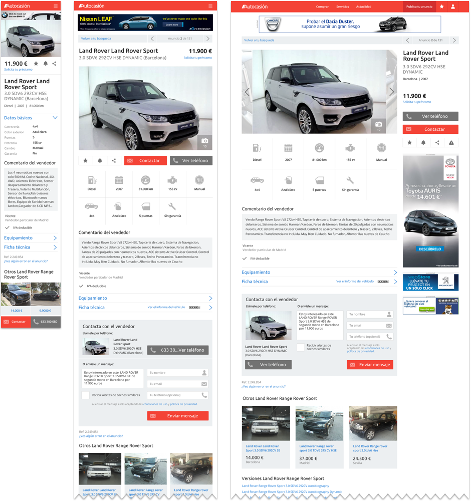
- Integrate optimized solutions for each of the resolutions (desktop, tablet and mobile), posing a responsive design.
In a first phase, during several months of 2015, we performed an analysis of the portal. This work included an heuristic analysis of flows and key portal screens and an a benchmark including reference portals and industry best practices.

Once the conclusions drawn, an interactive prototype was raised in low resolution, to test and validate the new portal structure; said functional prototype also served document for developers. Some of the improvements that were introduced were:
- A new structure supported by more visual elements and iconography, where information is easier to scan.
- Filters were improved at results pages, more scalable, so they are always present and accompany the user.
- Larger images in ads.
- Better pooling of information and calls to action.
- Equivalence of interaction elements for all devices.
- While respecting brand image above the portal.

The new version of the site was launched in June 2016. During the first week, visits multiplied x2, x3 reaching peaks up on the previous site, so that ended the year 2016 with 2 million unique users, up 13% from the previous year. That audience with its recurring visits, accumulated a total of 40 million visitors, with an average time spent on the portal of almost 4 minutes.
Since its release date, the new portal experienced a marked improvement in performance, but in early 2017, a number of factors beyond the portal begun to significantly impair the results: end the agreement with Milanuncios.com, changes at Google positioning algorithm, new competitors...
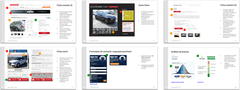
Autocasión product managers returned to trust us to review the design of the portal. Due to the strong growth of the portal, some inconsistencies both functional and visual were generated:
- Visual excess load, partly due to the great weight of advertising.
- Inconsistencies in the typographic scale, visual hierarchy and readability problems in some elements.
- Difficulty interacting with filters and controls on some devices.
- Conflicts between primary and secondary colors.
- Popups not optimized.
- Excess calls to action on some pages.
- ...
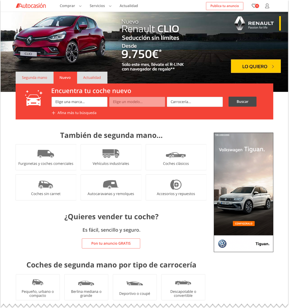
Generally speaking, we believed that we must make a commitment to further eliminate visual noise and unnecessary items.

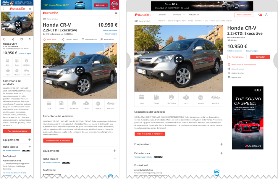
Over the existing structure, with the new design proposal we further focus on the definition of components and reuse of elements:
- We defined a single contact form is reused throughout the entire site, with a "tunneling effect" using a lightbox.
- Empowered the navigation between detail pages to facilitate exploration.
- Improve the design of the filters, giving more control to users.
- Limited color palette to improve readability, using only the corporate red for calls to action and blue for advertising elements.
- We normalized the typographic scale and vertical rhythms.

In summary, a realignment and simplification of modules in order to improve the growth portal and facilitate use by users.