Explaining the obvious (for you)
On productivity environments, one of the key points that interaction designers need to manage is the balance between easy of use and efficiency. As a general rule, facilitate the learning curve of a system tends to impair the efficiency of advanced users and viceversa.
Explanations, guidelines and assistive items are a must, but occupy a vital space in the working area. With the aim to promote “efficient communication”, is a common practice to abuse of jargon and acronyms.
E.g. let’s choose a task: exporting data. Sometimes as heavy users of the new technologies, we assume that many of the terms and acronyms commonly used, are known by all: XML , CSV , etc. before assuming this, test this concepts with your users, and you will have some surprises. This concepts are not familiar to all, and are quite technical.
The most popular and usable online app have detected this, and they did a good job balancing explanations and assistive items inside the exporting options flows:
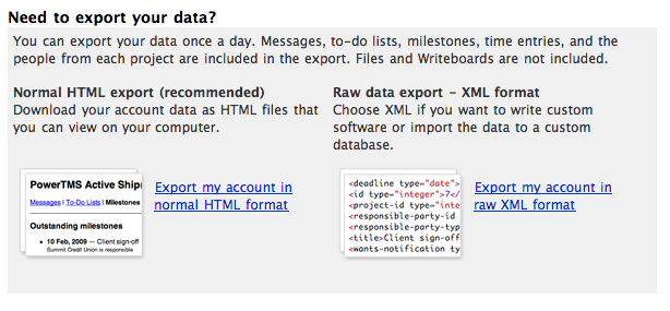
Basecamp offers explanations related to the tool itself, and a visual item to illustrate the export format. Perhaps not sufficiently explanatory for some users.

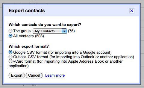
Gmail contacts indicates the most popular programs in which the file can be opened, an efficient and focused on productivity way.

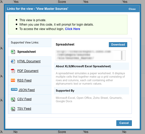
But my favorite one is Zoho, despite the placement of the action buttons, this app offers a good brief explanation of the format and fairly list of supported software.

These examples show that reserve a space (or elements) to assist users in production environments, often is the most profitable option. If do you know other interesting approaches for this scenario, please share it!